
My Design portfolio
My Professional Portfolio
Sector
Carrier, Design, Portfolio
My Role
Entire product design, UX Research, UX Design, UI Design, Prototyping
Tools
Figma, Figjam, Framer, Relum, Chat-GPT, Miro, Canava
Project Name
KunalS: A portfolio that speaks to both business and design.
Project Duration
Ongoing
Overview
The KunalS: A portfolio that speaks to both business and design project reflects my journey of professional and creative growth as a UX/UI Designer. What began as a simple static PDF portfolio has evolved into a fully interactive, branded website built from the ground up. Over the years, I experimented with various platforms — from Dribbble and Behance to Figma prototypes — before finally designing and developing a responsive website that embodies both my design philosophy and process.
In this project, I served as the sole designer, strategist, and developer, overseeing every aspect of the portfolio’s evolution — from branding and information architecture to prototyping and launch. The current version, built in Framer, integrates a custom logo, color system, and visual hierarchy to deliver a cohesive and user-centered experience that communicates my professional story effectively.
Purpose of the Portfolio
The goal of this redesign was to create a digital portfolio that not only showcases my work but also reflects my personality, process, and evolution as a designer. With each iteration, I aimed to improve storytelling, accessibility, and brand consistency — culminating in a platform that feels personal yet professional.
Key objectives included:
Establishing a strong personal brand identity through logo design, typography, and color language.
Building an intuitive information architecture (IA) to ensure recruiters and collaborators can easily navigate and access relevant projects.
Crafting a narrative-driven user flow that highlights my growth, design process, and versatility across industries.
Enhancing interactivity and responsiveness, allowing the portfolio to function seamlessly across devices.
Gaining full creative control over layout, content, and experience — something that platform-based portfolios couldn’t fully provide.
Problem Statement
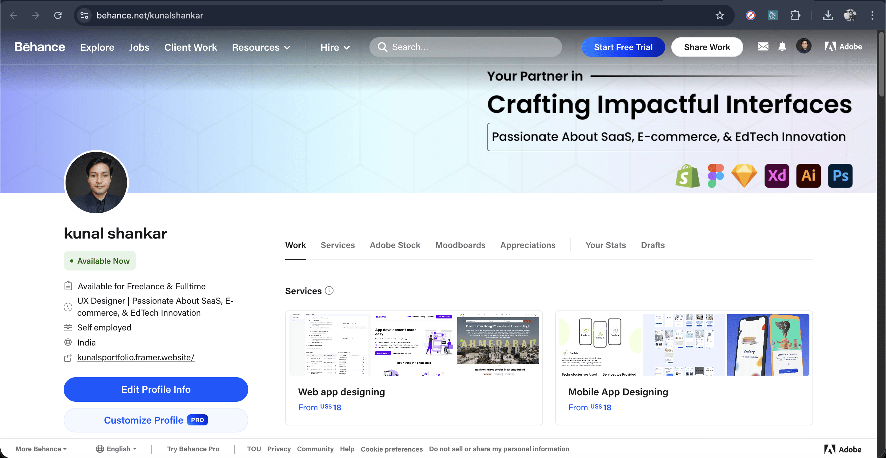
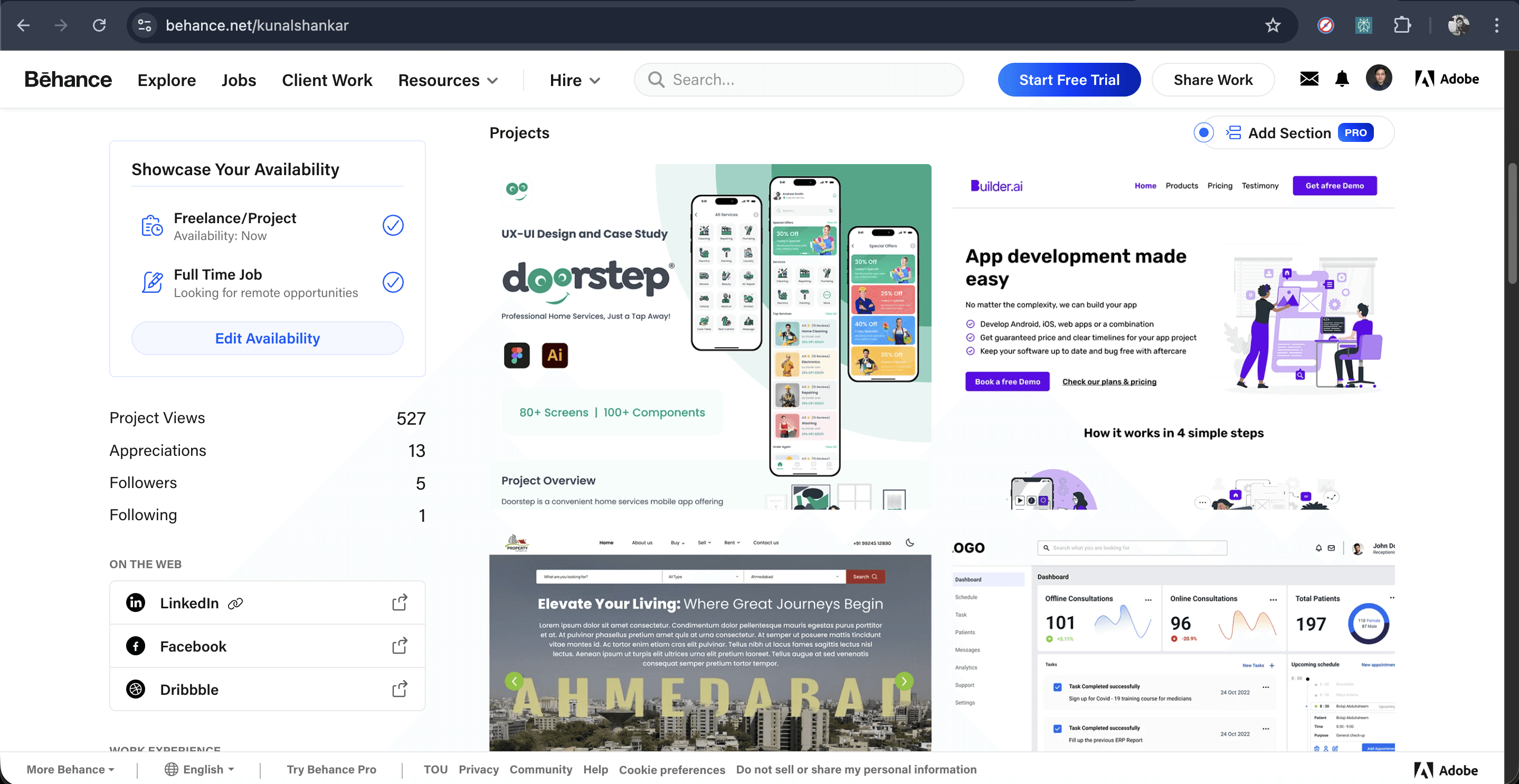
As my career advanced, my earlier portfolio formats — PDFs, Dribbble posts, and Behance pages — no longer represented my evolving skill set or the strategic depth of my design thinking. Each platform posed its own limitations:
Key objectives included:
PDFs lacked interactivity and were difficult to update.
Dribbble focused on visuals without context or narrative.
Behance restricted customization within platform templates.
Figma prototypes offered flexibility but weren’t accessible for non-design audiences.
The challenge was to design a unified, fully branded digital experience that goes beyond simply showcasing projects — one that narrates my journey, demonstrates my UX process, and communicates my creative identity through deliberate structure, motion, and visual storytelling.
Design Process
Meeting With Stakeholders
Secondary Research
Primary Research
Building Personas
Solutions
User Flow/ IA
Low Fidelity wireframes
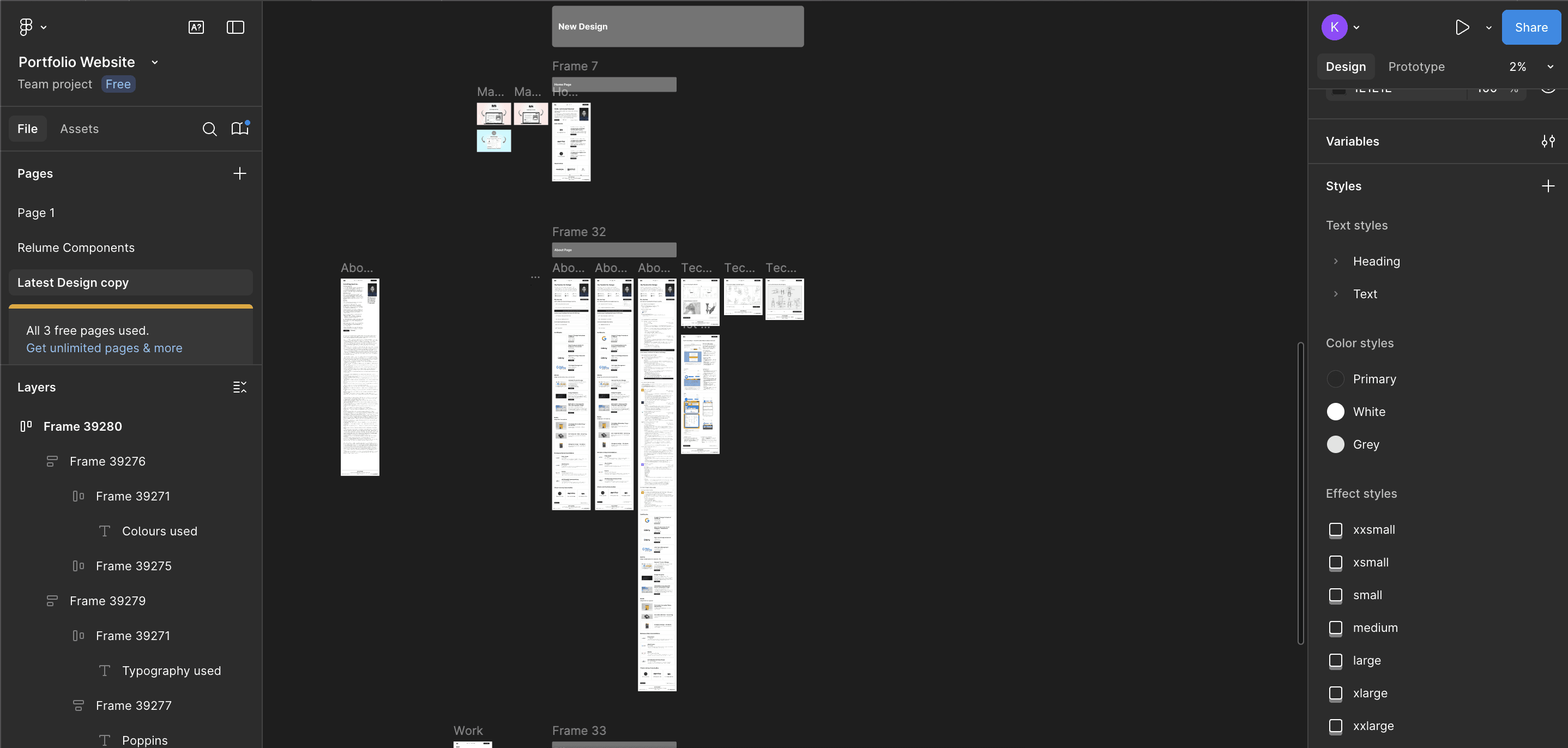
Building Design System
High Fidelity Wireframes
Prototyping
User Testing
Secondary Research Overview
Before beginning the redesign, I conducted secondary research to understand how top designers present their work online and what recruiters look for in a modern UX/UI portfolio. I analyzed leading portfolios on Behance, Dribbble, and personal websites of designers from agencies and tech companies to identify trends in layout, storytelling, and user experience
The research also focused on recruiter expectations, examining insights from portfolio reviews, hiring manager feedback, and UX career communities to uncover what makes a portfolio stand out — not only visually but strategically.
Goals for Secondary Research:
To identify industry standards and trends in UX/UI portfolio presentation.
To understand what hiring managers and recruiters prioritize, such as clarity, process visibility, and personality.
To evaluate platform limitations (Behance, Dribbble, Figma prototypes) versus the flexibility of a custom-built website.
To define the structure and flow of an ideal portfolio that balances creativity with usability.
To establish a content hierarchy that aligns with how users (recruiters, clients, peers) consume portfolio content.
Key Findings from Secondary Research
Recruiters spend less than 3 minutes scanning a portfolio — strong hierarchy, readability, and quick navigation are crucial.
Case studies that tell a story (problem → process → solution → impact) resonate more than visuals alone.
Interactive and personalized portfolios leave a stronger impression compared to templated Behance or Dribbble profiles.
Consistent visual branding (logo, color palette, typography) builds memorability and conveys professionalism.
Mobile-first design is essential — over 50% of portfolio reviews happen on tablets or mobile devices.
Authenticity matters — portfolios that include personality, process sketches, and learning reflections tend to perform better in interviews.
Competitor Analysis – Portfolio Inspiration
Before beginning the redesign, I reviewed several leading designer portfolios to understand how experienced UX/UI professionals structure, present, and narrate their work. The goal was to identify design trends, interaction patterns, and storytelling techniques that make portfolios stand out to recruiters and peers.
Portfolios analysed
Alva Henriksson – alvaux.com
Gloria Lo – glorialo.design
Vera Chen – verachen.me
Lola Jiang – lolajiang.com
General findings:
These portfolios demonstrate a strong clear branding (personal logo/identity) that helps the designer stand out and feel memorable.
Each site uses a case-study format that emphasizes process, not just visuals—showing research, thinking, iterations.
Navigation is intuitive, with simple menus, minimal distractions, and clear paths to projects which helps recruiters quickly scan.
Many use interactive or micro-interaction elements (hover states, animations, transitions) to make the experience feel polished and modern.
Mobile responsiveness and visual clarity across devices is prioritized—ensuring the portfolio works well on tablets/phones as much as desktop.
Visual hierarchy is strong: lead visuals draw interest, followed by succinct text + imagery, enabling fast consumption by hiring managers.
The limitations of template-based platforms are exposed: when control is limited (e.g., on platforms like Behance), customization and storytelling depth suffer.
Implications for My Portfolio Redesign:
I needed a strong, consistent personal brand (logo, palette, typography) akin to these examples.
Make sure each case study tells a story—challenge → process → solution → impact—rather than just showing final designs.
Prioritize performance, mobile UX, and intuitive navigation (mirroring what I observed).
Build in subtle interactions and visual polish to elevate the site above generic template portfolios.
Ensure full creative control over layout, content, and sequencing so I can craft the narrative rather than be constrained by a platform.
Primary Research
To understand how my portfolio was being perceived and how it could be improved, I conducted primary research through informal feedback sessions with recruiters, peers, and design mentors who had interacted with my earlier portfolio versions — including my Behance profile and Figma prototype.
The goal was to gather first-hand insights about usability, readability, visual appeal, and overall user experience from people who represented my real audience. I also observed user behaviors such as how they navigated between case studies and how much time they spent engaging with the content.
Goals of the research
To evaluate how engaging and intuitive the previous portfolio versions felt to users.
To identify pain points around navigation, performance, and content hierarchy.
To understand recruiter expectations — what they look for first and what keeps them engaged.
To use feedback to shape decisions for the redesign — especially around interactivity, storytelling, and load performance.
Key findings from feedback
“Make it interactive.” - Users wanted the site to feel more alive — I incorporated micro-interactions and hover states for smoother transitions and engagement.
“Add small interactions.” - Repetitive content flow made earlier versions feel static — I introduced scroll-based animations and hover reveals to keep attention.
“Highlight contents for better readability.” - The text contrast and spacing were adjusted; I refined typography hierarchy and added section dividers for easier scanning.
“There’s nothing much to view.” - Previous versions lacked depth — I expanded case studies with visuals, process breakdowns, and storytelling elements.
“Takes too much time to load.” - Optimised media assets, image compression, and Framer performance settings to ensure faster loading and smoother transitions.
Solution Based on Secondary and Primary Research
Leveraging insights from both industry research and direct user feedback, I designed a fully branded, performance-optimised portfolio website using Framer that uniquely reflects my identity, process, and growth as a designer. The solution addresses key pain points from earlier formats and delivers a richer, more accessible experience for recruiters, peers, and collaborators.
Key components of the solution
Distinct Visual Brand: A custom logo, consistent colour palette, and typography system unify the site and enhance memorability.
Refined Information Architecture & User Flow: Intuitive navigation and clear content hierarchy allow users to quickly explore my levels of experience, case studies, and credentials.
Interactive Story-Driven Case Studies: Each project journey moves beyond visuals to show process, learnings, and impact—embodied within the live website.
Micro-Interactions & Performance Optimised Design: Smooth transitions, hover states, and fast load times directly respond to user demands for responsiveness and engagement.
Cross-Platform Accessibility: The site adapts effortlessly across desktop and mobile devices, ensuring every visitor experiences the portfolio at its best.
User flow/ Information Architecture (IA)
The Information Architecture of my portfolio was carefully structured to provide a clear, intuitive, and engaging browsing experience for recruiters, peers, and collaborators. The goal was to help visitors quickly understand who I am, what I do, and how I work—all while maintaining a smooth, story-driven flow through the site.
The portfolio is divided into four key sections, each designed to guide users naturally from introduction to deeper engagement:
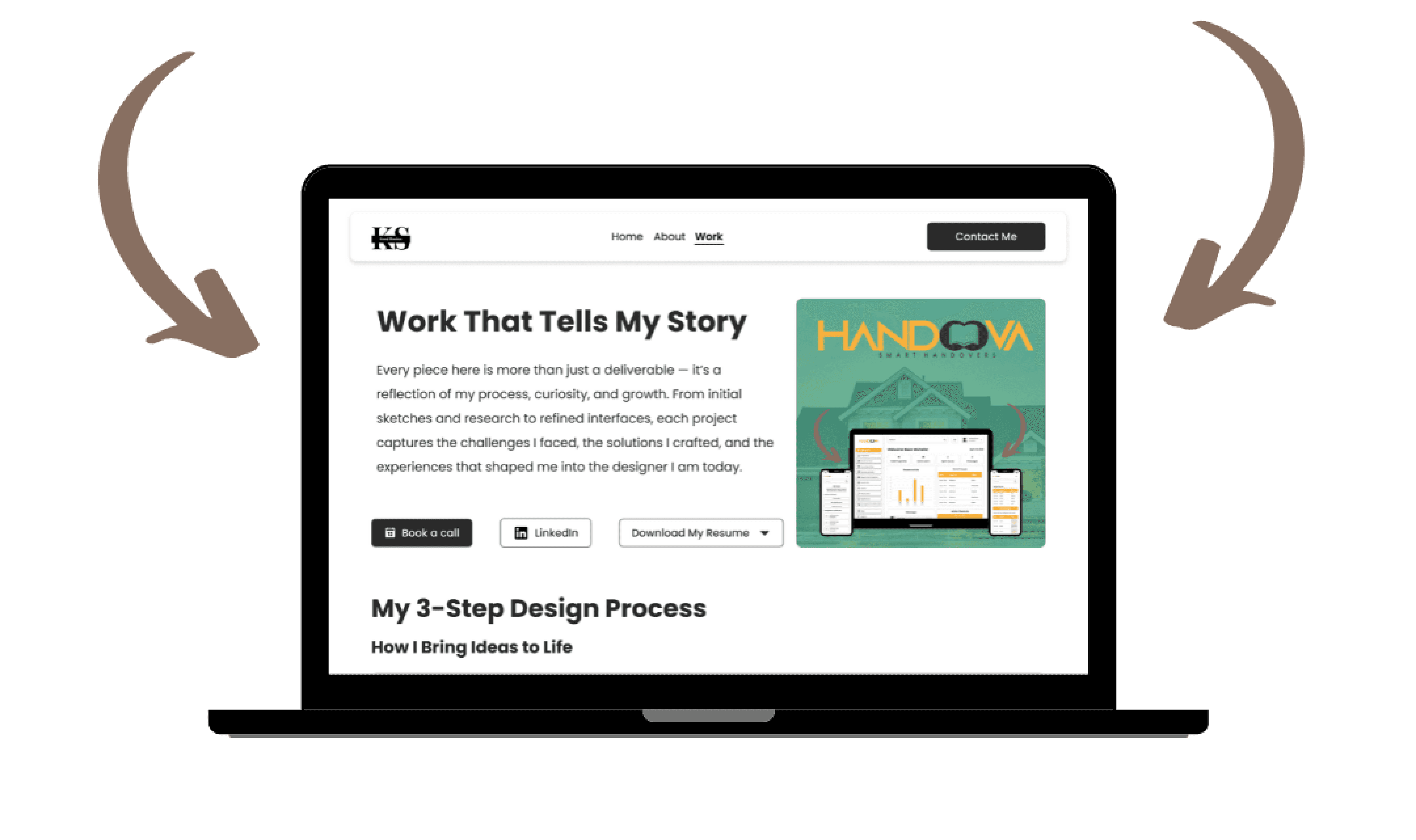
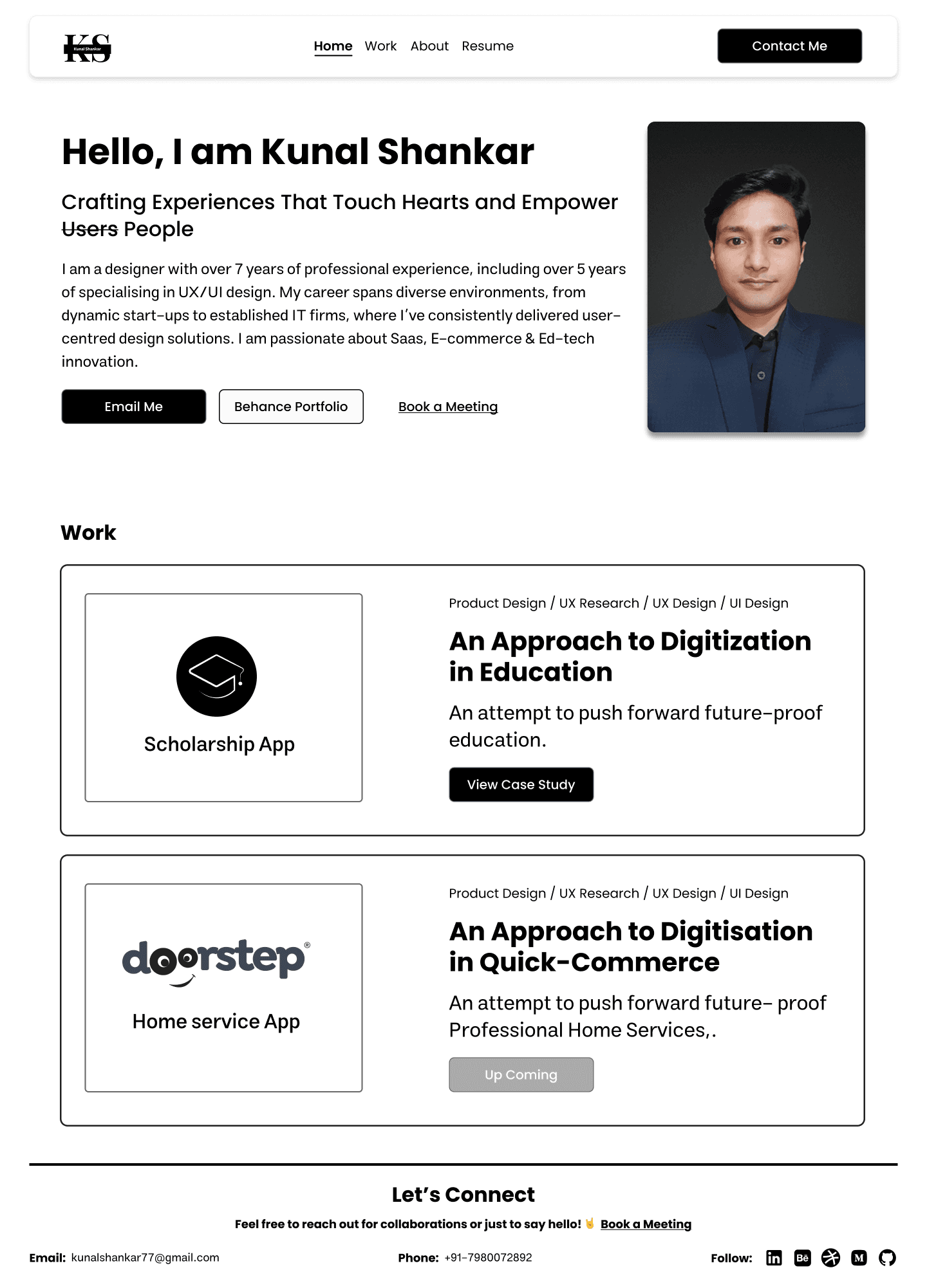
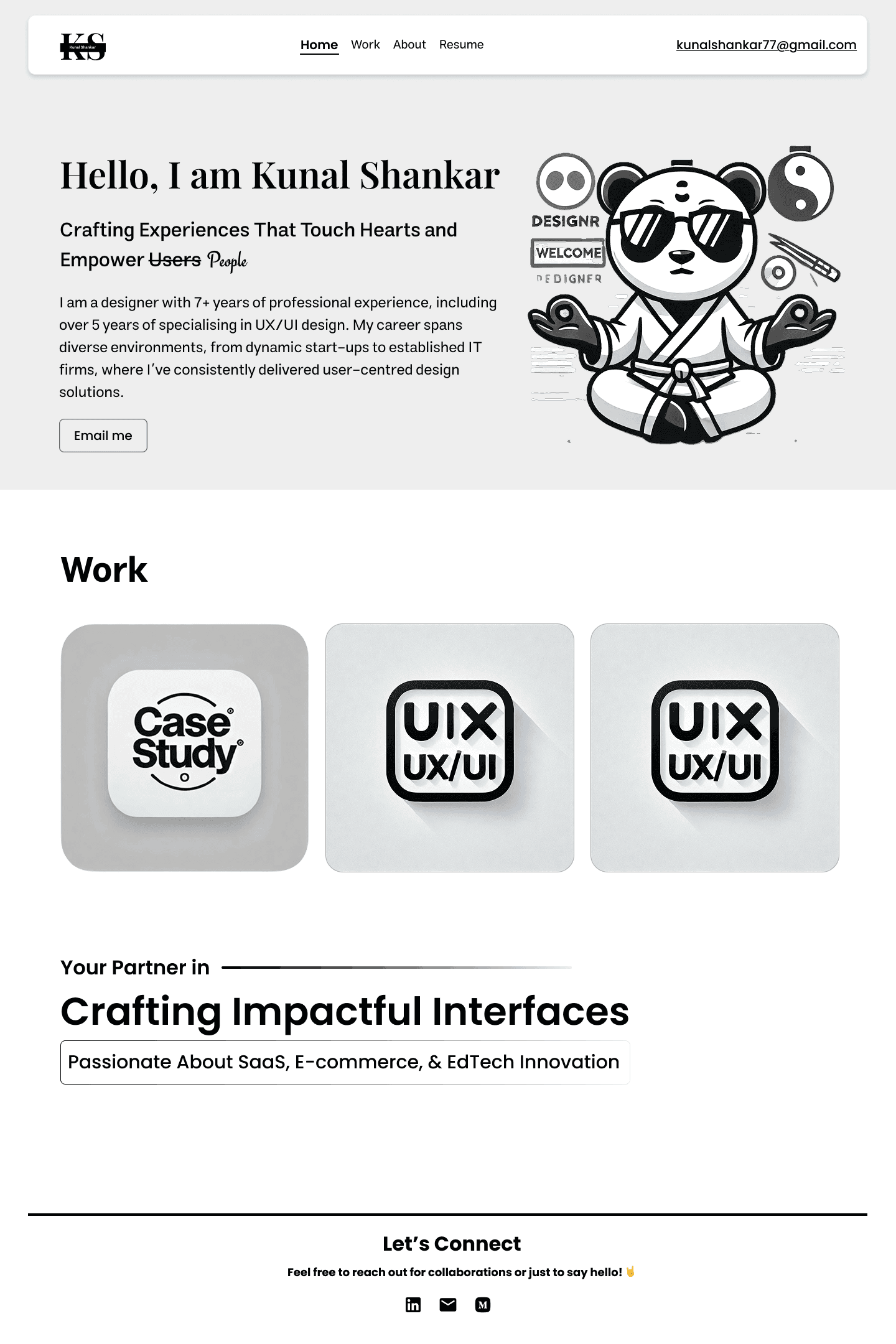
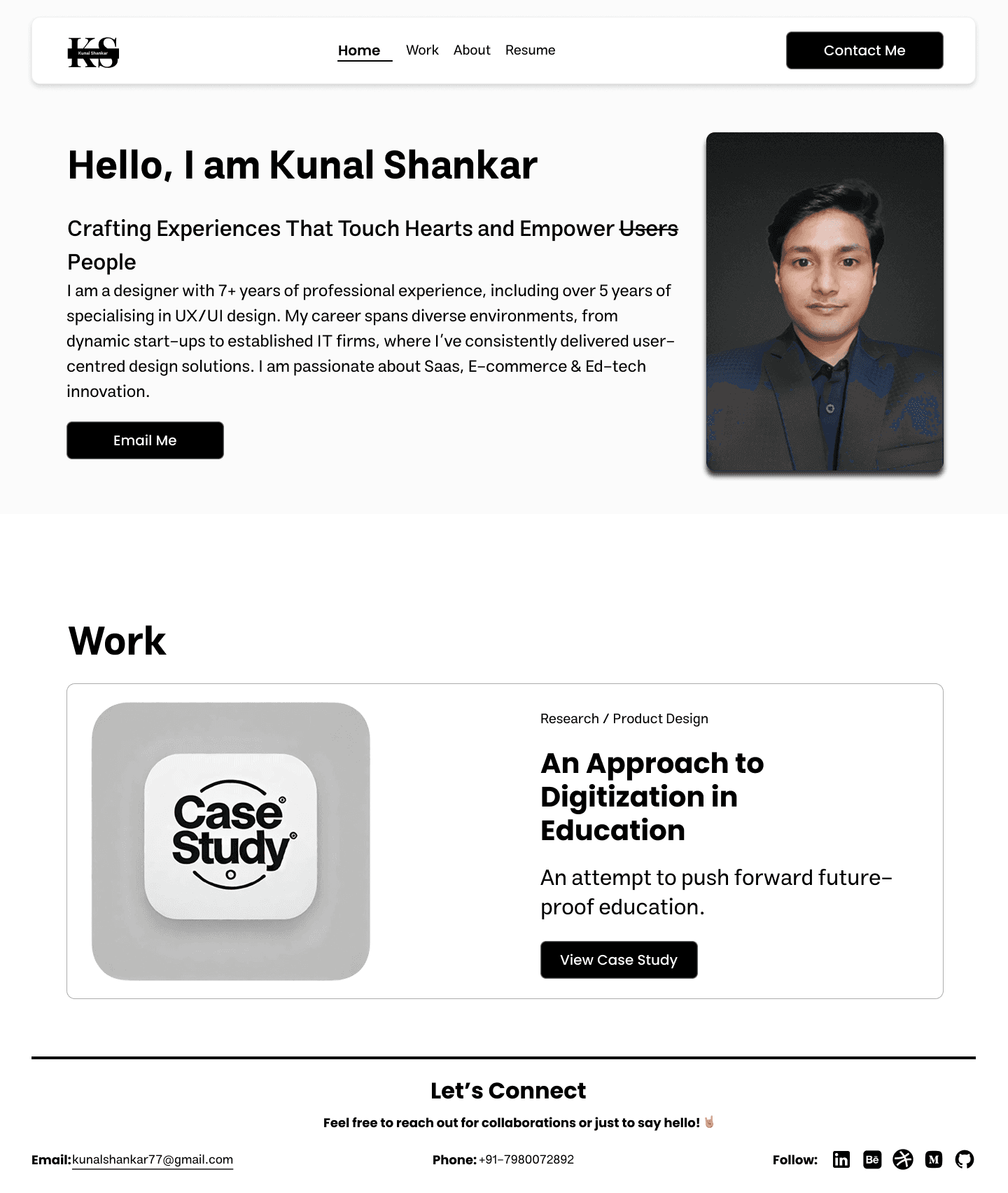
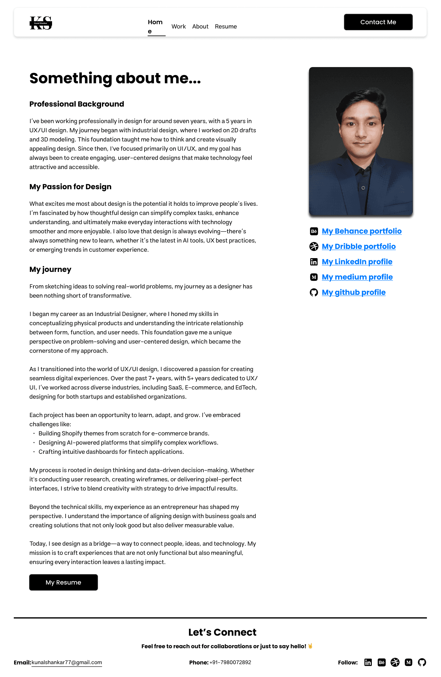
Home - Serves as the welcoming gateway to my portfolio — offering a concise introduction, highlighting my design philosophy, and directing users toward my About and Work pages.
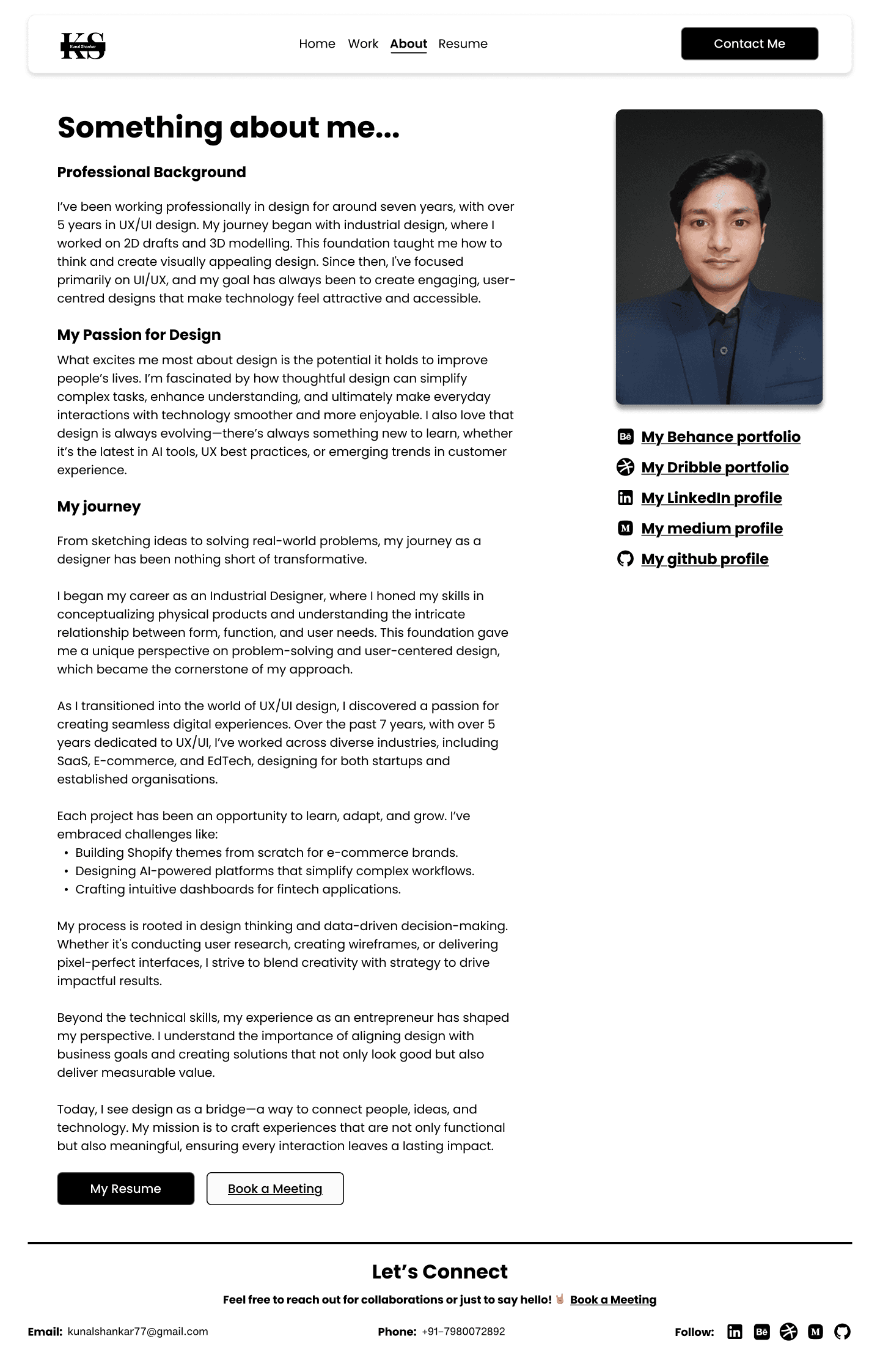
About - Shares my professional journey and personal evolution as a designer with a mix of storytelling and visuals for better relatability.
Work - Acts as the core of the portfolio, presenting my case studies, creative work, and recent projects in an organized, easy-to-navigate layout.
Contact - A simple, direct page designed for easy communication with recruiters and collaborators.

Initial Designs
Previously used portfolio's

Rough sketches/ideations
The 1st and 2nd home page draft
The 3rd draft
Previously used figma prototype

Building style guide
Logo used
White theme

Dark theme
Logo design philosophy
The “KS” logo embodies simplicity, balance, and professionalism. Its clean geometry and minimal design reflect a modern aesthetic that adapts seamlessly across light and dark themes. Built on the principle of clarity and timelessness, it represents my approach to design — elegant, adaptable, and purpose-driven.
Colours used
#FFFFFF
#000000
#CCCCCC
Colour philosophy
My portfolio uses a neutral color palette of black, white, and grey to promote accessibility, balance, and focus. These tones create a calm, distraction-free environment that enhances readability and ensures inclusivity for users with visual sensitivities, reflecting a design ethos rooted in clarity and comfort.
Typography used
Poppins
Regular
Medium
Semibold
Type face/Font philosophy
I chose Poppins for its geometric structure and clean readability, offering a modern, approachable, and highly legible experience across all devices. Its balanced aesthetic supports clarity and inclusivity, aligning with my belief that good design communicates effortlessly.
All icons are used from Phosphor Icons and some are custom-made.
Conclusion
The Portfolio Redesign project represents more than just a visual refresh — it’s a reflection of my growth, maturity, and evolving identity as a designer. What began as a simple PDF has now transformed into a fully branded, interactive, and thoughtfully crafted digital experience that tells my story end-to-end.
Through research, iteration, and feedback, I built a portfolio that balances clarity, creativity, and functionality — one that not only showcases my work but also demonstrates how I think, design, and solve problems. The final website gives me complete creative control, a strong personal brand presence, and a dynamic space that evolves as I continue to grow in my career.
This redesign taught me that a portfolio isn’t just about displaying projects — it’s about communicating purpose, process, and personality.
Next version update
For the next version of my portfolio, I plan to extend the experience beyond desktop by designing and optimizing it for mobile and tablet screens, ensuring seamless accessibility across all devices. The goal is to maintain the same level of interactivity, hierarchy, and storytelling while adapting layouts and interactions to smaller viewports for smoother navigation and readability.
Additionally, I’ll be introducing a Dark Theme version to enhance visual comfort and give users the flexibility to switch between light and dark modes based on their preference or environment. This update will not only improve usability but also add a refined, modern touch to the overall experience — keeping the portfolio visually dynamic, adaptive, and future-ready.
Learnings
Learned how to build a complete portfolio ecosystem from strategy to deployment — including branding, IA, user flow, and development within Framer.
Strengthened my understanding of accessible design principles, ensuring that users with visual sensitivities or color perception challenges can browse comfortably.
Discovered the importance of neutral color systems — using black, white, and greys — to maintain focus on content and imagery while supporting readability and visual balance.
Improved my ability to design for performance and responsiveness, ensuring smooth interactions and fast loading times across devices.
Gained deeper insight into how storytelling and UX structure together can shape a designer’s professional identity online.
Challenges Solved
Solved accessibility concerns by adopting high-contrast neutrals and avoiding color-dependent cues, allowing all users — including those with color vision deficiencies — to navigate comfortably.
Addressed readability and visual clarity issues by refining typography hierarchy, spacing, and section dividers for smoother content flow.
Resolved performance bottlenecks from previous versions by optimizing assets and improving Framer page load efficiency.
Overcame engagement gaps through subtle micro-interactions, motion effects, and smoother transitions to keep users interested throughout their visit.
Unified multiple past portfolio formats into a single consistent identity, ensuring my brand, process, and storytelling feel cohesive and professional.
Recent works


" height="26.158567070103608px" id="lXrpap7NW" transform="translate(3.689 2.918)" width="26.15855065841994px"/></svg>)
" height="26.8125px" id="X0_5DBdh7" transform="translate(4.125 1.563)" width="24.75px"/></svg>)
Let's connect
Feel free to reach out for collaborations or just to say hello! 🤘
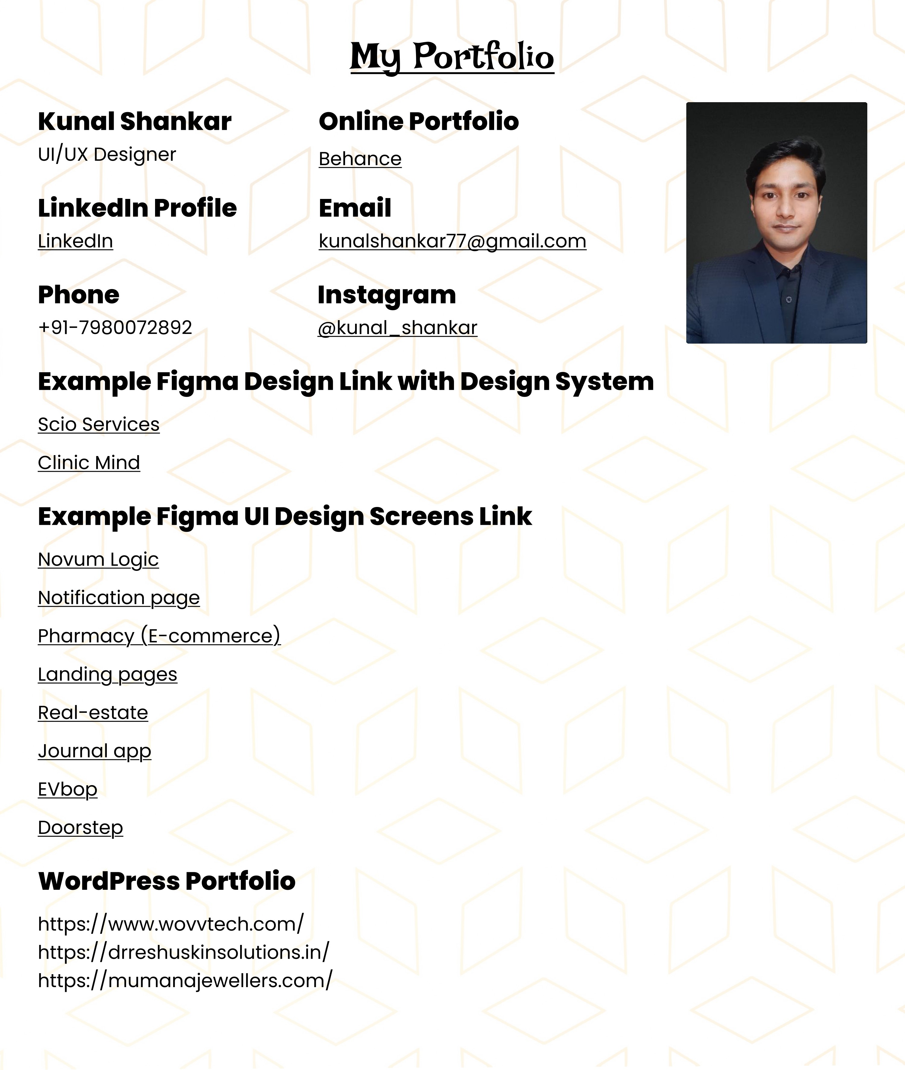
Email:
Kunalshankar77@gmail.com
Phone:
+91-7980072892
Follow:
" height="24px" id="AEnhlwlv0" transform="translate(4.493 4)" width="23.99999px"/></svg>)
" height="6.962585221328528px" id="XAclm3fFB" transform="translate(10.299 12.484)" width="4.245814666434837px"/><path d="M 19.319 12.545 C 19.251 12.385 19.148 12.242 19.017 12.127 C 18.886 12.012 18.732 11.928 18.564 11.881 C 18.229 11.79 17.879 11.77 17.536 11.824 C 17.193 11.878 16.865 12.005 16.575 12.195 C 16.285 12.487 16.098 12.866 16.041 13.273 C 16.041 13.416 16.041 13.443 16.211 13.443 L 19.371 13.443 C 19.527 13.443 19.527 13.443 19.513 13.247 C 19.498 13.002 19.433 12.763 19.319 12.545 Z M 19.319 12.545 C 19.251 12.385 19.146 12.242 19.016 12.127 C 18.885 12.012 18.732 11.928 18.564 11.881 C 18.229 11.79 17.879 11.77 17.536 11.824 C 17.193 11.878 16.865 12.005 16.575 12.195 C 16.285 12.487 16.097 12.866 16.04 13.273 C 16.04 13.416 16.04 13.443 16.209 13.443 L 19.371 13.443 C 19.527 13.443 19.527 13.443 19.513 13.247 C 19.498 13.002 19.43 12.763 19.316 12.545 M 20.8 0 L 5.2 0 C 3.821 0 2.498 0.548 1.523 1.523 C 0.548 2.498 0 3.821 0 5.2 L 0 20.8 C 0 22.179 0.548 23.502 1.523 24.477 C 2.498 25.452 3.821 26 5.2 26 L 20.8 26 C 22.179 26 23.502 25.452 24.477 24.477 C 25.452 23.502 26 22.179 26 20.8 L 26 5.2 C 26 3.821 25.452 2.498 24.477 1.523 C 23.502 0.548 22.179 0 20.8 0 Z M 15.704 8.28 C 15.704 8.177 15.704 8.137 15.821 8.137 L 20.033 8.137 L 20.033 9.231 C 20.033 9.231 20.037 9.308 19.968 9.308 L 15.887 9.308 C 15.704 9.308 15.704 9.308 15.704 9.127 Z M 11.804 17.836 C 10.204 18.707 7.515 18.356 4.329 18.356 L 4.329 7.579 L 9.412 7.579 C 10.712 7.579 12.259 7.904 12.675 9.281 C 12.891 9.883 12.878 10.543 12.638 11.135 C 12.398 11.728 11.948 12.211 11.375 12.493 C 11.903 12.689 12.365 13.032 12.705 13.482 C 13.045 13.932 13.249 14.469 13.292 15.032 C 13.336 15.594 13.218 16.156 12.952 16.653 C 12.686 17.15 12.283 17.561 11.791 17.836 Z M 21.489 14.768 L 16.289 14.768 C 16.147 14.768 16.016 14.845 16.041 15.028 C 16.197 15.795 16.548 16.601 17.343 16.719 C 17.762 16.844 18.212 16.824 18.619 16.664 C 19.026 16.504 19.369 16.212 19.591 15.835 C 19.591 15.835 19.656 15.756 19.695 15.756 L 21.385 15.756 C 21.385 15.756 21.489 15.756 21.463 15.847 C 21.284 16.352 21.021 16.822 20.683 17.237 C 20.231 17.669 19.686 17.991 19.089 18.177 C 18.493 18.364 17.862 18.411 17.244 18.314 C 16.627 18.218 16.04 17.98 15.53 17.62 C 15.019 17.259 14.598 16.786 14.3 16.237 C 14.117 15.871 14.002 15.474 13.963 15.067 C 13.731 14.042 13.908 12.968 14.457 12.072 C 15.005 11.176 15.882 10.53 16.9 10.271 C 19.851 9.633 21.723 11.661 21.723 14.521 C 21.727 14.555 21.724 14.589 21.713 14.621 C 21.702 14.653 21.684 14.682 21.66 14.705 C 21.636 14.729 21.607 14.747 21.575 14.758 C 21.543 14.769 21.509 14.772 21.476 14.768 Z M 18.577 11.881 C 18.243 11.789 17.892 11.769 17.549 11.825 C 17.207 11.879 16.9 11.944 16.588 12.195 C 16.276 12.444 16.111 12.865 16.055 13.273 C 16.055 13.416 16.055 13.443 16.224 13.443 L 19.371 13.443 C 19.527 13.443 19.527 13.443 19.513 13.247 C 19.498 13.002 19.433 12.763 19.319 12.545 C 19.251 12.385 19.148 12.242 19.017 12.127 C 18.886 12.012 18.732 11.928 18.564 11.881 Z" fill="rgb(0, 0, 0)" height="25.99997px" id="tZJP9vVhA" transform="translate(3.827 3.332)" width="26.000049999999998px"/></svg>)
" height="24.5528675px" id="EQkLbcg8J" transform="translate(4.237 3.723)" width="24.511977499999997px"/></svg>)

" height="26.0206814479928px" id="LnFdkBMBU" transform="translate(3.16 2.668)" width="26.666619999999998px"/></svg>)