

Re-designing Claim Management Dashboard
Sector
Insurance Claim, FinTech, SaaS
My Role
Entire product design, UX Research, UX Design, UI Design, Prototyping
Tools
Figma, Figjam, Miro, Chat-GPT, Ux Pilot, Microsoft 360, Canava
Deliverables
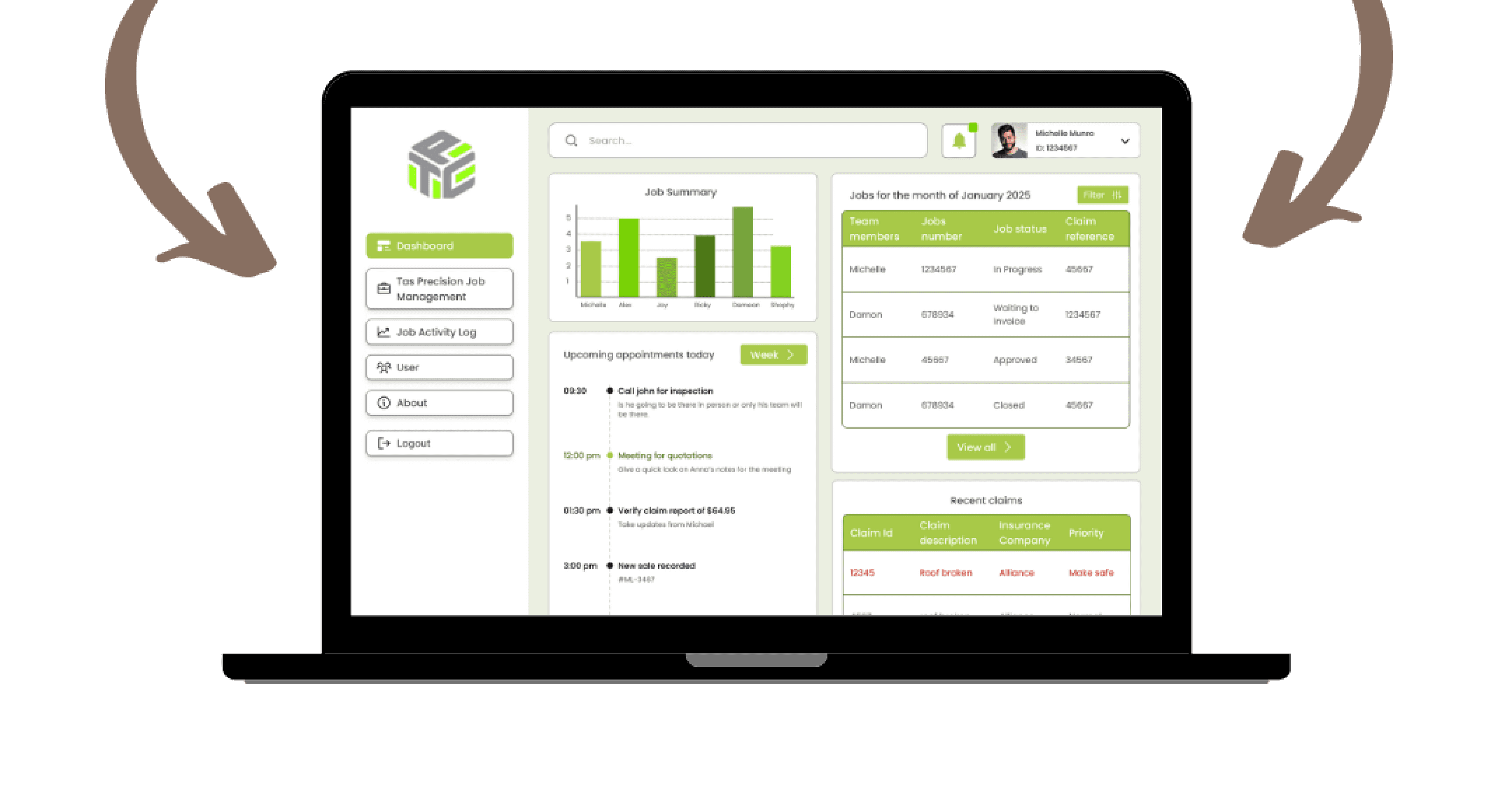
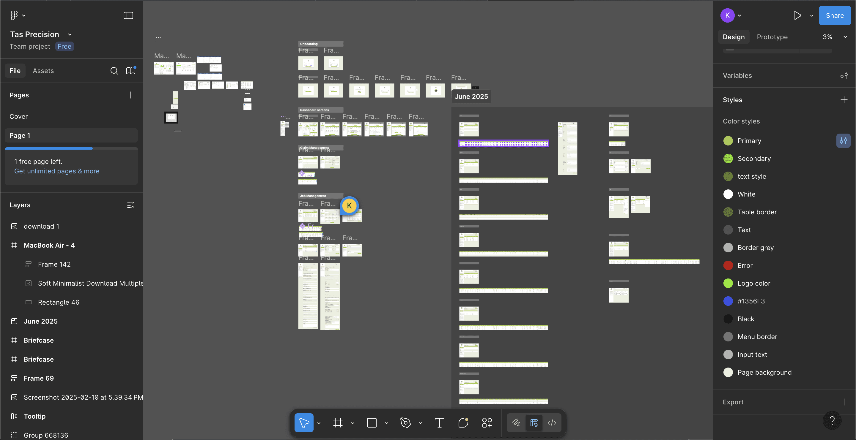
A dashboard product screens in Figma.
Project Name
Tas Precision
Project Duration
4 Weeks
Project owners
Media Clock
Project stakeholders
BA, PM, Developers, QA, Client
Overview
The TAS Precision Dashboard Redesign project focused on transforming an outdated and complex claim management system into a streamlined, user-friendly, and data-driven platform. The redesigned dashboard consolidates job tracking, claim approvals, and user management into a single, intuitive interface. It enables teams to monitor project progress, view performance analytics, and manage claims seamlessly — all within one cohesive environment.
Purpose of the SaaS Product
The main objective of this redesign was to simplify daily operations for TAS Precision’s internal teams by creating a clear, consistent, and responsive interface. The platform was reimagined to:
Present data in a visually structured and accessible way.
Enable faster decision-making through real-time job tracking and performance insights.
Provide role-based access and control, ensuring each user interacts only with relevant information.
Reduce manual errors and administrative effort by automating repetitive workflows such as claim updates, approvals, and notifications.
This redesign aimed to enhance both usability and efficiency, helping teams move from a cluttered, text-heavy interface to a modern, insight-oriented experience.
Problem Statement
The previous system was visually dense, difficult to navigate, and lacked information hierarchy, forcing users to manually dig through multiple tables to locate claims or job details. There was no effective way to track claim status, manage users, or filter jobs dynamically, leading to frequent confusion and delays in operations.
The challenge was to redesign the claim management experience—creating a dashboard that not only organizes information logically but also empowers users to act quickly and confidently through simplified layouts, clear visual cues, and data transparency.
Design Process
Meeting With Stakeholders
Secondary Research
Primary Research
Building Personas
Solutions
User Flow/ IA
Low Fidelity wireframes
Building Design System
High Fidelity Wireframes
Prototyping
User Testing
Conclusion
The redesign of the TAS Precision Claim Management Dashboard transformed a cluttered and data-heavy system into a clean, intuitive, and efficient workspace. By rethinking the information hierarchy and aligning the design with real user workflows, the platform now enables faster decision-making, better visibility into claims, and smoother coordination across teams. The new interface not only improved usability but also strengthened trust and productivity among internal stakeholders, marking a major step forward in operational efficiency.
If there was more time available…
If I had more time, I would focus on integrating data visualization dashboards with advanced filters and predictive insights to help teams identify trends and performance gaps quickly. Additionally, I’d conduct usability testing with different user roles to refine micro-interactions, accessibility, and mobile responsiveness—further optimizing the platform for real-world use and scalability.
Learnings
Gained a deeper understanding of designing data-heavy dashboards while maintaining visual clarity and usability.
Strengthened my ability to create role-based user experiences, ensuring relevant access and simplified workflows for each user type.
Learned how to balance functional density with visual minimalism, presenting complex claim data in a digestible way.
Improved collaboration with cross-functional teams (BA, PM, developers, QA) to ensure design feasibility and smooth handoff.
Enhanced my skills in information architecture and system mapping, especially for SaaS-based enterprise products.
Challenges Solved
Simplified complex claim tracking and job management through structured layouts and clear categorization.
Solved the issue of information overload by introducing filtered views, visual hierarchies, and concise data tables.
Improved navigation efficiency with a sidebar-based structure, enabling faster access to key functions like jobs, users, and notifications.
Enhanced task visibility by adding performance summaries, activity logs, and real-time job progress indicators.
Reduced manual errors and confusion by automating claim updates and improving system feedback loops.
Case Studies

" height="26.8125px" id="X0_5DBdh7" transform="translate(4.125 1.563)" width="24.75px"/></svg>)
Let's connect
Feel free to reach out for collaborations or just to say hello! 🤘
Email:
Kunalshankar77@gmail.com
Phone:
+91-7980072892
Follow:
" height="24px" id="AEnhlwlv0" transform="translate(4.493 4)" width="23.99999px"/></svg>)
" height="6.962585221328528px" id="XAclm3fFB" transform="translate(10.299 12.484)" width="4.245814666434837px"/><path d="M 19.319 12.545 C 19.251 12.385 19.148 12.242 19.017 12.127 C 18.886 12.012 18.732 11.928 18.564 11.881 C 18.229 11.79 17.879 11.77 17.536 11.824 C 17.193 11.878 16.865 12.005 16.575 12.195 C 16.285 12.487 16.098 12.866 16.041 13.273 C 16.041 13.416 16.041 13.443 16.211 13.443 L 19.371 13.443 C 19.527 13.443 19.527 13.443 19.513 13.247 C 19.498 13.002 19.433 12.763 19.319 12.545 Z M 19.319 12.545 C 19.251 12.385 19.146 12.242 19.016 12.127 C 18.885 12.012 18.732 11.928 18.564 11.881 C 18.229 11.79 17.879 11.77 17.536 11.824 C 17.193 11.878 16.865 12.005 16.575 12.195 C 16.285 12.487 16.097 12.866 16.04 13.273 C 16.04 13.416 16.04 13.443 16.209 13.443 L 19.371 13.443 C 19.527 13.443 19.527 13.443 19.513 13.247 C 19.498 13.002 19.43 12.763 19.316 12.545 M 20.8 0 L 5.2 0 C 3.821 0 2.498 0.548 1.523 1.523 C 0.548 2.498 0 3.821 0 5.2 L 0 20.8 C 0 22.179 0.548 23.502 1.523 24.477 C 2.498 25.452 3.821 26 5.2 26 L 20.8 26 C 22.179 26 23.502 25.452 24.477 24.477 C 25.452 23.502 26 22.179 26 20.8 L 26 5.2 C 26 3.821 25.452 2.498 24.477 1.523 C 23.502 0.548 22.179 0 20.8 0 Z M 15.704 8.28 C 15.704 8.177 15.704 8.137 15.821 8.137 L 20.033 8.137 L 20.033 9.231 C 20.033 9.231 20.037 9.308 19.968 9.308 L 15.887 9.308 C 15.704 9.308 15.704 9.308 15.704 9.127 Z M 11.804 17.836 C 10.204 18.707 7.515 18.356 4.329 18.356 L 4.329 7.579 L 9.412 7.579 C 10.712 7.579 12.259 7.904 12.675 9.281 C 12.891 9.883 12.878 10.543 12.638 11.135 C 12.398 11.728 11.948 12.211 11.375 12.493 C 11.903 12.689 12.365 13.032 12.705 13.482 C 13.045 13.932 13.249 14.469 13.292 15.032 C 13.336 15.594 13.218 16.156 12.952 16.653 C 12.686 17.15 12.283 17.561 11.791 17.836 Z M 21.489 14.768 L 16.289 14.768 C 16.147 14.768 16.016 14.845 16.041 15.028 C 16.197 15.795 16.548 16.601 17.343 16.719 C 17.762 16.844 18.212 16.824 18.619 16.664 C 19.026 16.504 19.369 16.212 19.591 15.835 C 19.591 15.835 19.656 15.756 19.695 15.756 L 21.385 15.756 C 21.385 15.756 21.489 15.756 21.463 15.847 C 21.284 16.352 21.021 16.822 20.683 17.237 C 20.231 17.669 19.686 17.991 19.089 18.177 C 18.493 18.364 17.862 18.411 17.244 18.314 C 16.627 18.218 16.04 17.98 15.53 17.62 C 15.019 17.259 14.598 16.786 14.3 16.237 C 14.117 15.871 14.002 15.474 13.963 15.067 C 13.731 14.042 13.908 12.968 14.457 12.072 C 15.005 11.176 15.882 10.53 16.9 10.271 C 19.851 9.633 21.723 11.661 21.723 14.521 C 21.727 14.555 21.724 14.589 21.713 14.621 C 21.702 14.653 21.684 14.682 21.66 14.705 C 21.636 14.729 21.607 14.747 21.575 14.758 C 21.543 14.769 21.509 14.772 21.476 14.768 Z M 18.577 11.881 C 18.243 11.789 17.892 11.769 17.549 11.825 C 17.207 11.879 16.9 11.944 16.588 12.195 C 16.276 12.444 16.111 12.865 16.055 13.273 C 16.055 13.416 16.055 13.443 16.224 13.443 L 19.371 13.443 C 19.527 13.443 19.527 13.443 19.513 13.247 C 19.498 13.002 19.433 12.763 19.319 12.545 C 19.251 12.385 19.148 12.242 19.017 12.127 C 18.886 12.012 18.732 11.928 18.564 11.881 Z" fill="rgb(0, 0, 0)" height="25.99997px" id="tZJP9vVhA" transform="translate(3.827 3.332)" width="26.000049999999998px"/></svg>)
" height="24.5528675px" id="EQkLbcg8J" transform="translate(4.237 3.723)" width="24.511977499999997px"/></svg>)

" height="26.0206814479928px" id="LnFdkBMBU" transform="translate(3.16 2.668)" width="26.666619999999998px"/></svg>)